Let’s Collaborate


As part of a design challenge by Bland AI I had to redesign the Conversational Pathway page. The following document is the design brief provided by Bland AI:
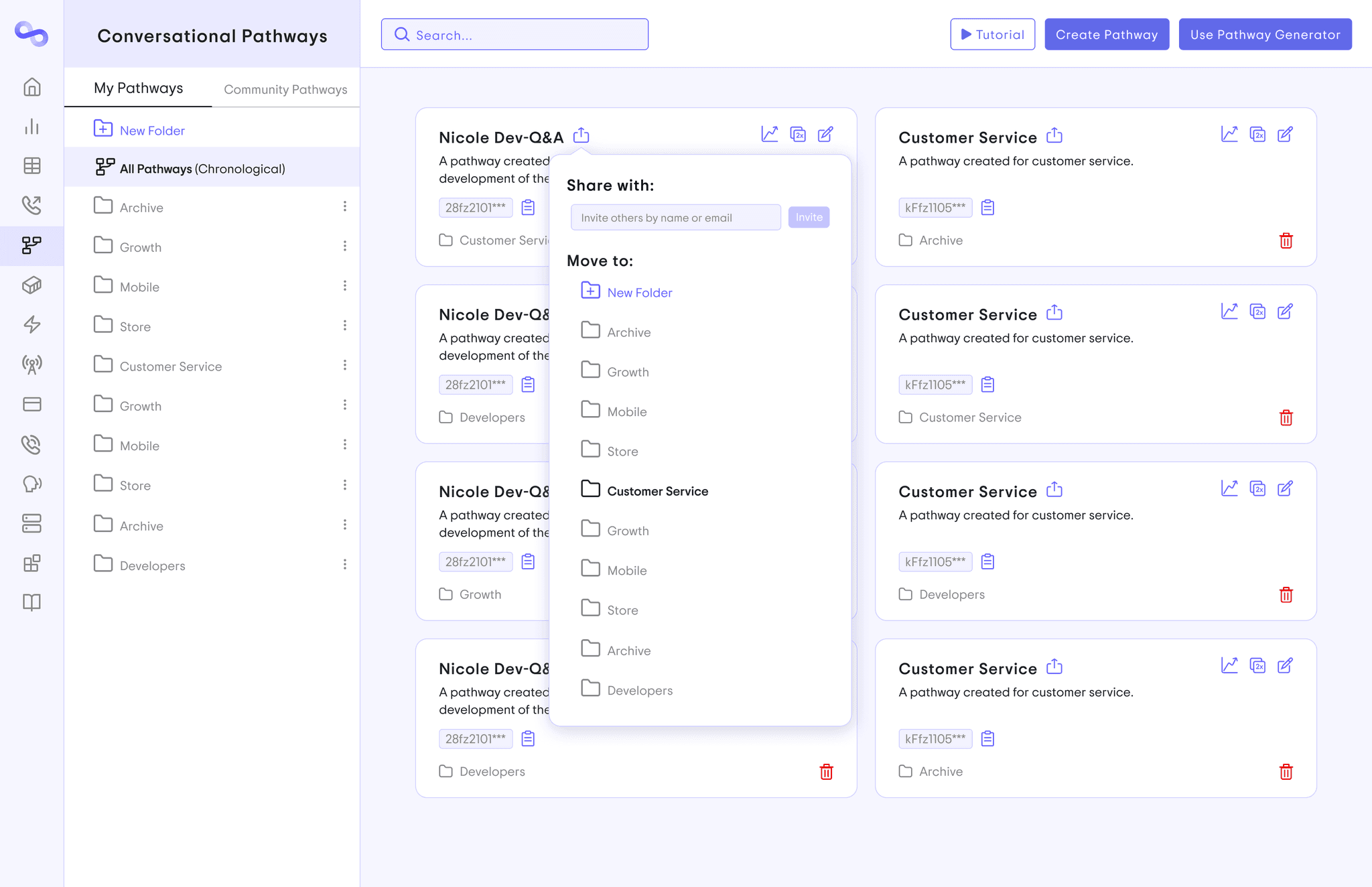
The following UI redesign is my work:
The following UI redesign is my work:
As part of a design challenge by Bland AI I had to redesign the Conversational Pathway page. The following document is the design brief provided by Bland AI:
Here are the key design updates and improvements I made, focusing on usability, clarity, and alignment with Bland AI's vision:
Icon Redesign: I created a new icon for Conversational Pathways, replacing the previous one (which resembled a sharing function). The new design more accurately represents the structure of a Pathway and better aligns with Bland AI’s branding.
Enhanced Usability: To support power users, I added a search function, making it easier to locate specific Pathways, while improving the overall user experience.
Onboarding Optimization: The tutorial is now positioned adjacent to the "Create Pathway" button to streamline onboarding for new users, making the platform more intuitive from the start.
Accidental Action Prevention: I repositioned the delete button away from the duplicate button to prevent accidental deletions when a user wants to duplicate a Pathway.
Analytics Integration: An analytics button has been added to the top right corner of the Pathway cards, alongside the duplicate and edit icons, to provide users with quick access to performance metrics.
Improved Sharing: The share button next to the title allows users to easily reorganize Pathways into folders and share them with other members, fostering collaboration.
Terminology Refinement: I replaced "Your Pathways" with "My Pathways" to create a stronger sense of ownership for users, and "Pathway Showcase" has been renamed to "Community Pathways" for greater clarity and intuitiveness. Users can easily switch between "My Pathways" and "Community Pathways" by clicking on the respective tabs, which are placed next to each other for seamless navigation.
UI Streamlining: I removed the open button, as the action is already intuitive by clicking on the Pathway card itself to open it, simplifying the interface.
Visual Distinction: To improve navigation, I adjusted the background of different sections, making them more distinct and easier to differentiate.
Swiss Design Principles: I applied the alignment principles of Swiss Design to ensure the interface is visually organized, creating a more structured and aesthetically pleasing user experience.
Call-to-Action Emphasis: The "Create Pathway" and "Use Pathway Generator" buttons are both highlighted in purple, ensuring new users can easily identify them.
Chronological Pathways: I added the label "Chronological" next to "All Pathways" to clearly indicate that users can view their most recent Pathways there, enhancing clarity and usability.
Font Change: While the previous font appeared to be Inter or Sans Serif typeface (both simple and commonly used) I switched it to "Trip Sans" This font closely resembles your current one but offers a cleaner, more modern and sleek look, particularly in the letter "a" which fits more closely with the style of the Bland AI logo.
Bland AI UI/UX
Figma
Bland AI UI/UX
Figma
Bland AI UI/UX
Figma
As part of a design challenge by Bland AI I had to redesign the Conversational Pathway page. The following document is the design brief provided by Bland AI:
The following UI redesign is my work:
he key design updates and improvements I made, focusing on usability, clarity, and alignment with Bland AI's vision:
Icon Redesign: I created a new icon for Conversational Pathways, replacing the previous one (which resembled a sharing function). The new design more accurately represents the structure of a Pathway and better aligns with Bland AI’s branding.
Enhanced Usability: To support power users, I added a search function, making it easier to locate specific Pathways, while improving the overall user experience.
Onboarding Optimization: The tutorial is now positioned adjacent to the "Create Pathway" button to streamline onboarding for new users, making the platform more intuitive from the start.
Accidental Action Prevention: I repositioned the delete button away from the duplicate button to prevent accidental deletions when a user wants to duplicate a Pathway.
Analytics Integration: An analytics button has been added to the top right corner of the Pathway cards, alongside the duplicate and edit icons, to provide users with quick access to performance metrics.
Improved Sharing: The share button next to the title allows users to easily reorganize Pathways into folders and share them with other members, fostering collaboration.
Terminology Refinement: I replaced "Your Pathways" with "My Pathways" to create a stronger sense of ownership for users, and "Pathway Showcase" has been renamed to "Community Pathways" for greater clarity and intuitiveness. Users can easily switch between "My Pathways" and "Community Pathways" by clicking on the respective tabs, which are placed next to each other for seamless navigation.
UI Streamlining: I removed the open button, as the action is already intuitive by clicking on the Pathway card itself to open it, simplifying the interface.
Visual Distinction: To improve navigation, I adjusted the background of different sections, making them more distinct and easier to differentiate.
Swiss Design Principles: I applied the alignment principles of Swiss Design to ensure the interface is visually organized, creating a more structured and aesthetically pleasing user experience.
Call-to-Action Emphasis: The "Create Pathway" and "Use Pathway Generator" buttons are both highlighted in purple, ensuring new users can easily identify them.
Chronological Pathways: I added the label "Chronological" next to "All Pathways" to clearly indicate that users can view their most recent Pathways there, enhancing clarity and usability.
Font Change: While the previous font appeared to be Inter or Sans Serif typeface (both simple and commonly used) I switched it to "Trip Sans" This font closely resembles your current one but offers a cleaner, more modern and sleek look, particularly in the letter "a" which fits more closely with the style of the Bland AI logo.
Let’s Collaborate


Let’s Collaborate

